Chimney Piece

line
Saturday, 19th March 2005, page 2 of 3
Wild West Yorkshire nature diary

navigation bar
navigation bar

chimneyNow, don't get me wrong, fixed-point perspective isn't the be-all and end-all of representational art - the Egyptians and the Chinese managed perfectly well without it - but I've noticed that so many of my students don't seem to be seeing objects as I do. This doesn't mean that they're doing 'bad' drawings. My assumption has been that they are distorting perspective either for expressive reasons or because they're making architectural studies of details such gothic arches, pediments and windows.

Or are they really not seeing things in perspective?

I decide to put them to the test by getting everybody to draw the same chimney and dormer window from the same angle, down on the precinct. This time I insist that they should draw it in perspective, exactly as they see it. No free expression. No architectural analysis. Just as it is, seen from our particular viewpoint

A Fresh Angle

chimneyHere are the most common mistakes that my students tend to make:

  1. They draw the line of the top of the chimney too close to the horizontal. From where we're seeing it, it appears to slope back at quite an angle (at about '4 o'clock' to use the clock-face analogy I described last week. I also get them to hold up a pencil to check the angle).

  2. They straighten up the roof of the dormer window too.

  3. They straighten up the lower ends of the bargeboards of the dormer window. I know that in reality they are level but imagine that someone had nailed a piece of timber stretching from one to the other; seen from down here, that piece of timber would slope off into perspective, just like the cliché telegraph wires and railway lines in perspective diagrams. The lower ends of the bargeboards have to conform to that.

  4. The proportions of the plain areas, for instance the brickwork between more interesting details such as the chimney pots and dormer window, sometimes get ignored. Here, the panel of brickwork on the left side of the chimney, above a string-course of raised bricks, is a square seen in perspective, like this square, rather than a tall rectangle seen in perspective, like this: rectangle.


Pot Shots

One student is having difficulty with the pots themselves; he can't get them to look right.

chimney pots
chimney pots
chimney pots

One trick I've heard of (David Gentleman once mentioned it on a television demonstration he gave) is to continue the curve of the top of the chimney slightly around the back.

This is in contrast to drawing an arc and adding two descending lines, which gives a flat, cut-out effect.

Perhaps you can see it better if I draw a close-up of the angle: in (1.) the angle between curve and vertical is too abrupt but in (2), where I've taken the curve around just a little, you get a better impression of a cylindrical object.

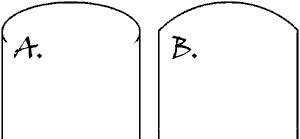
chimney pot diagramsMy wobbly pen line smooths out the effect so, just to make it clear, here's a diagram drawn on the computer.

A. The curve of the top of the chimney is taken around the back slightly, giving an impression of a three-dimensional object.

B. The curve abuts abruptly with the verticals so this looks more like a cut-out two-dimensional object, such as the end of a palette knife.

A Word of Warning

But I'd be wary of adopting this trick: it could so easily become a mannerism. The important thing is to be aware that you're drawing part of an ellipse which disappears out of sight: you're not drawing an arc or fan-shape, snipped off abruptly at either end. Next Page

Richard Bell, richard@willowisland.co.uk

navigation bar
navigation bar