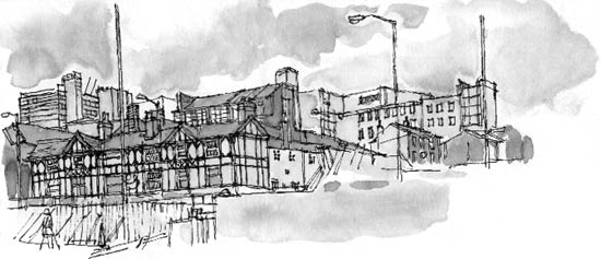
The Tone of this Town
When I was working on location in Sheffield yesterday, I made a
first attempt at adding a wash of diluted Chinese ink
to a Rotring Rapidoliner drawing. When I looked
at the drawing later, I realised that the washes had dried out several
tones lighter than they had appeared when wet. For example, the
chimney and narrow end of the building in the middle of the drawing
should have been a real 'plum' of dark tone, which I think would
have set off the paler tones.
Mock tudor buildings, like the large public house in the foreground,
are sometimes referred to as 'black and white' but, of course, it
wasn't really black and white: compared to the brightest
tone in the picture - the patches of sky visible through the cloud
- the walls appeared as a pale shade of grey.
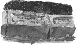
Bricks in the Wall
4 p.m., greenhouse
I need more practice with a simple subject and more time than I
had yesterday, when, literally, I was aware that I had a train to
catch.
Today, even though I know what to expect and I mix my washes darker,
I'm still convinced that I've lost half of my drawing when I add
the final wash to the shaded side of the bricks. You don't see that
interesting gradation in tone, which is a good equivalent of the
tones of these unevenly fired old bricks, until the wash starts
to dry out.
I realise that you've got to be bold, if not reckless, when applying
tonal washes.
The initial drawing of the bricks was made with a Staedtler
Mars Professional, 0.35 tip. 
Richard Bell, [email protected]
|