Wild West Yorkshire, Tuesday, 28 December 2010, page 1 of 2
previous | this month | next
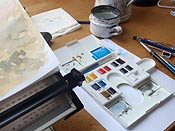
 IT'S A PLEASURE to receive a new box of watercolours as a Christmas gift. This Winsor & Newton Cotman Compact Set appeals to my love of gadgets with its unfolding mixing palettes and central thumb grip.
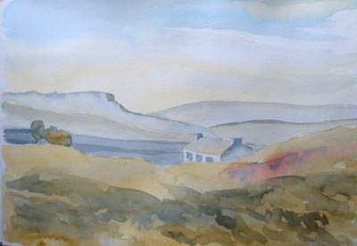
Just for fun, I try following the introductory Water Colour Demonstration included on the accompanying leaflet. It takes less than an hour for me to complete, part of the time taken up by gathering together the recommended media they suggest.
'Paper of good quality is important,' they insist, 'lower quality paper such as cartridge paper will give dull washes and will absorb colour unevenly.'
That's obviously where I've been going wrong for the past 40 years! I go to the sketchbook drawer of my plan chest for a pad of acid-free watercolour paper which I've never had occasion to use. It's A3 which is two or three times as big as the sketchbooks that I would normally use.
 Real Life v. Visual Reference
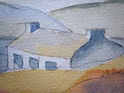
I find it a little disconcerting following someone else's example because I find myself wondering, what am I trying to do? - Paint the hills or paint someone else's interpretation of the hills? I'm used to having the real hills in front of me when I go out with my sketchbook and watercolours and that makes things simple because my reference for line, colour, tone and texture is always right there in front of me. With a demonstration like this, I'm constrained to copying shapes on a page.
I've always thought it odd that indoor watercolour classes are so popular because invariably people have to work from a photograph and who wouldn't rather be outside painting but I enjoy following this demonstration in the same way that I'd enjoy following a recipe for baking bread or scones. You start with simple ingredients and if you follow the instructions you should end up with something pretty similar to the finished example. I'm rather hooked on it now and want to try another!
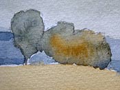
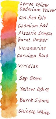
This demonstration uses washes of Yellow Ochre and Cerulean Blue in the sky and elsewhere while the grey of the lake is a mixture of Ultramarine and Burnt Sienna and that's it - apart from the addition of some red to suggest heather near the cottage.
The colours included were as shown in my swatch (right) except for Alizarin Crimson which I added from an old paint box.
I realise by briefly trying the watercolourist's approach to painting that I'm very much an illustrator by nature. If I'd been out drawing this scene from life I would have spent time carefully drawing the vegetation in the foreground, so that you'd be able to make a guess as to whether it consists of grasses, thistles or heather but the demonstration calls for you to take an Ultramarine and Yellow Ochre mixture that you've used for the trees and the shadows on the hills and to 'lay it over part of the foreground you have already painted'.
It takes some restraint for me not to go into more detail but I think the paint effects that result from following this watercolourist method (left) are more interesting than my usual pen and wash approach to this kind of detail. Besides, on such textured paper, it would be difficult to work in much detail.
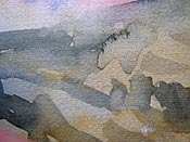
With my fascination with detail in my drawings I'm actually denying the viewer of the finished picture the opportunity for them to use their imagination. Looking at a traditional watercolour is more of a collaboration between the artist and the viewer.
Richard Bell, illustrator
previous | this month | Wild West Yorkshire home page | next