|
 With
some of my Sushi Sketchbooks it's obvious which image should
go on the cover - the mist on the moors for Langsett, the
headland for Distant Northern Sea and the red shed for
Normanton - but Saints and Serpents, my sketchbook
from the rural east coast of Norfolk, has been a problem. With
some of my Sushi Sketchbooks it's obvious which image should
go on the cover - the mist on the moors for Langsett, the
headland for Distant Northern Sea and the red shed for
Normanton - but Saints and Serpents, my sketchbook
from the rural east coast of Norfolk, has been a problem.
I didn't have one image that summed up the subject matter of cottage
garden, coast and medieval church. I thought of using the 950 year
old oak tree I'd drawn at Fairhaven but that didn't seem to work
with my title, which comes from the serpentine forms and symbols
I found in the landscape and in the church.
|
 Snakes
and Ladders Snakes
and Ladders
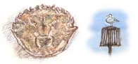
Then I thought of the Snakes and Ladders board in a compendium
of games in the cottage and I thought it would be fun to make a mock-up
board with a selection of my illustrations arranged on the squares.
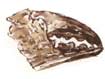
One of my favourite pages in the book is one of fragments of crab shell
I picked up on the strandline on Mundersley beach. The page reminds me
of the pleasures of beachcombing. I went into Photoshop on the computer
and arranged a couple of these on the cover along with a gull and a couple
of serpents. That was it; it summed up the subject matter and the holiday
atmosphere and I decided not to bother with the device of the board itself.
Photoshopping
I find working with images in Photoshop fascinating but, apart from the
limited things I do with it, I'm no expert so I was glad when my artist/journalling
pal Danny Gregory gave me a few tips when he was over
here from New York in June. Without going into technical detail I'll just
mention that when you're colouring a drawing, as I coloured the snake
and ladder for this cover, use 'darken' as the blending
mode when you fill the selected part of the drawing with colour.
That won't mean anything to you if you don't use Photoshop but that simple
click in an options box has made a huge difference to the way I colour
drawings. Can't wait to do the next one!
Hand-lettering versus Typesetting
 So
far, every word and title of each of the Sushi Sketchbooks has
been hand-lettered. Working on the cover rough I quickly typed in the
title and author just to show where the hand-lettering would go. I used
a typeface called 'Papyrus' and selected the colour by using the eyedropper
tool (left) in Photoshop to pick up a sample of colour from the
drawings. So
far, every word and title of each of the Sushi Sketchbooks has
been hand-lettered. Working on the cover rough I quickly typed in the
title and author just to show where the hand-lettering would go. I used
a typeface called 'Papyrus' and selected the colour by using the eyedropper
tool (left) in Photoshop to pick up a sample of colour from the
drawings.
The trouble is the typeset version looks so suitable - the way it hints
at the medieval elements in the sketchbook and the way those big Ss resemble
serpents - that I found I couldn't then improve on it by using my own
lettering.
 Looks
like it will have to stay. And why not? I really should improvise and
have fun with these sketchbooks. That's the whole point. Looks
like it will have to stay. And why not? I really should improvise and
have fun with these sketchbooks. That's the whole point. 
Related Links
Sketchbook Sushi
Danny Gregory
Richard Bell, [email protected]
|