 |
Which comes first . . . the book
or the cover? I'm in a 'chicken and egg' situation with my garden
book: until I've sorted out the content I won't know exactly what
the cover should look like but, equally, I could do with some idea
of the cover so that I can set about telling the story it suggests.
There are so many possibilities from all the material I have in
my sketchbooks.
 This
morning a blank 96 page dummy of the book arrives and by the time
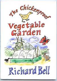
Barbara gets home at lunchtime I've drawn this design (left)
on its cover. It's only a rough but Barbara says: 'I like that;
if it was me I'd leave it just as it is.' This
morning a blank 96 page dummy of the book arrives and by the time
Barbara gets home at lunchtime I've drawn this design (left)
on its cover. It's only a rough but Barbara says: 'I like that;
if it was me I'd leave it just as it is.'
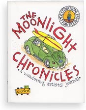
This design is inspired by the cover of Dan Price's
The Moonlight Chronicles colour paperback compilation.
He uses curved freehand outline lettering coloured in red and, as
it happens, he has a green humpy object on the cover: a Volkswagen
Beetle.
But Price omits the chicken. |
Back Cover Blurb
I'd like my book to be irresistible to pick up in a book shop and
Price's cover would definitely encourage me to pick it up.
When I was mulling over the content of the book in this diary the
other day I came up with a paragraph which I thought could serve
as a mission statement for the book. I've written it, from memory,
on the back cover of the dummy: I can elaborate on this later; it's
not intended to be word perfect. I want to give readers an instant
impression of the contents so I sketch in a few of the creatures
and plants that make the garden a delightful place to draw in.
Colour Spreads
I decide that I'll try and go through the 48 double-page spreads
of the entire dummy book indicating pages in this rough way. I'm
keen to see how the 16 double-page colour spreads will fit into
the flow of the book. I think it's going to work out just right;
it will have the feel of one of my sketchbooks.
It's good to be able to handle this rough version: a book is a
tactile as well as a visual thing. It's not like this online diary;
you don't see it behind a sheet of glass as an electronic glow.
It's good to have a real object in my hands. |
|
The Trowels of Life

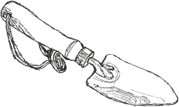
Traditional garden tools are good to handle too. This one, designed for
young gardeners by Joseph Bentley of Wimslow, Cheshire,
is a beautifully made object, with a solid ash handle (and, to give it
a certain cachet, it's wearing a leather thong). It's costs less that
we often pay for a coffee and a cake.
Bentley's point out:
In prolonged dry conditions the handle may shrink slightly and the
head become loose. This is not a defect and is perfectly natural. The
tool can be restored to its original tightness very easily by immersing
in water overnight.
Inky Fingers
 When
I took out my new Rapidoliner pen to draw the cover artwork
this morning it had leaked slightly. As I was in the studio, I was able
to grab a tissue and clean it up then wash the ink off my fingers but
it puts me off using it on location. I need something that is 100% reliable.
To give it a chance I need to try it with a new refill. When
I took out my new Rapidoliner pen to draw the cover artwork
this morning it had leaked slightly. As I was in the studio, I was able
to grab a tissue and clean it up then wash the ink off my fingers but
it puts me off using it on location. I need something that is 100% reliable.
To give it a chance I need to try it with a new refill.
Anyway, because of that, I decided that for this trowel I'd try drawing
in dip pen and ink, which I haven't done for ages. I
like the quality of the line. As it's been so long since I've done much
drawing with a dip pen I found the way it moved about the page unfamiliar
and the trowel ended up out of proportion.
A Boon and a Blessing
I liked the way it scritched springily across the page, giving an wiry
energy to the line that I don't think you get with fibre tip pen. I used
black FW Acrylic Artists Ink and a Waverley
nib:
They come as a boon and a blessing to men
The Pickwick, the Owl and the Waverley Pen
Was the Victorian advertising slogan. 'The Waverley pen had a turned
up point rather than a convex point,' explains the The Birmingham
Pen Trade Heritage Association website (see link below),
'This took the extreme point of the pen off the paper and made writing
smoother.' Glad I've got one, sounds perfect for drawing. I wonder if
they're still available. 
Related Links
The Birmingham
Pen Trade Heritage Association
www.nibs.tk
Richard Bell, [email protected]
|
![]()