Richard Bell's Wild West Yorkshire nature diary
A Book & its Cover
‹previous
| this month | home
page | e-mail me | next›
Friday, 12th January, 2007
 THE
GROUND AROUND the feeder is smooth and wet but it's not just those pheasants
that have pummeled it: we've had wild, wet, windy weather most of the week and
the ground can't take any more. When it rains small puddles form on the bare
ground.
THE
GROUND AROUND the feeder is smooth and wet but it's not just those pheasants
that have pummeled it: we've had wild, wet, windy weather most of the week and
the ground can't take any more. When it rains small puddles form on the bare
ground.
The lawn looks threadbare and I'm looking forward to the fresh green shoots
of the spring.
 It
wouldn't be impossible to go out drawing but for the time being I'm fine-tuning
my walks book. I intended this to be a simple booklet to occupy me during the
winter months.
It
wouldn't be impossible to go out drawing but for the time being I'm fine-tuning
my walks book. I intended this to be a simple booklet to occupy me during the
winter months.
Why is it taking so long?
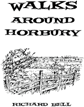
Today I've been thinking about the cover, what colour card should I use? I'm
going for black only on the cover. As far as I remember, I've produced only
one book with a monochrome cover; The Natural History of Wakefield
in 1978, and that was brown lettering on cream card.
 For
the walks booklet I think I'll go for green, but softer than the one above;
more like a sage green.
For
the walks booklet I think I'll go for green, but softer than the one above;
more like a sage green.
I like that typeface (above), which is Crazy Loot BT inline.
It's one of the 200 basic fonts that come with Page Plus 11,
the desktop publishing software that I'm using.
My first version
of the cover used Arial which looked clear and reliable, both important qualities
in a walks book, but didn't, for me, convey the fun and sense of freedom you
get when walking.
A serif face, such as
Times Roman, gives a hint of the history of the landscape you're walking through
but it can look a bit authoritative. When you walk you're escaping for a while
from your routine obligations.
So
that leaves the 'handwritten' fonts; they have the feeling of freedom that you
get when out walking; of the improvisation that comes in when you have to vary
your route because of flooding or overgrown stretches of footpath (both problems
that I've had to address in the booklet).
But does a handwritten look rather wayward?
 Would
you trust a walks book with this kind of typeface on the cover?
Would
you trust a walks book with this kind of typeface on the cover?
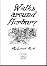 Striding
or Strolling?
Striding
or Strolling?
I think Informal Roman (left) works well , although
it suggests a walker who is striding rather than strolling.
Informal Roman is a font in Open Type format by Esselte (1997), supplied with
Microsoft Publisher 2003.
‹previous
| this month | home
page | e-mail me | next›