Richard Bell's Wild West Yorkshire nature diary
Travels around my Paintbox
‹previous
| this month | home
page | e-mail me | next›
 Sunday,
29th April, 2007
Sunday,
29th April, 2007
AFTER READING Victoria Finlay's Colour, Travels
through the Paintbox (see 7th April).
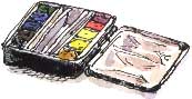
I thought it was about time that I reacquainted myself with my own paintbox.
I bought this credit card-sized box (which is sold empty, so you can select
your own colours) two years ago, just before we set off on holiday to Mallorca.
I wanted it to be as lightweight as possible so that I could pop it into a bum-bag
with a small sketchbook when we set off walking in the hills.
Primaries
For artists wishing to mix colours from the three primaries, Winsor
& Newton recommend:
Winsor Lemon, Winsor Blue (Red Shade)
and Permanent Rose.
I couldn’t find a box that took only three colours so I went for their
recommendation for a six colour mixing system:
Winsor Lemon, Winsor Yellow,
French Ultramarine, Winsor Blue (Green Shade),
Permanent Rose and Scarlet Lake.
This still left four half-pan slots in the paintbox so, as I found it was
a bit of a bind putting all three colours together for a brown or grey, I added
some secondary/tertiary colours:
| |
 |
|
|
|
|
Permanent Rose |
Scarlet Lake |
Winsor Lemon |
Winsor Yellow |
Yellow Ochre |
|
|
|
|
|
Permanent Sap Green |
French Ultramarine |
Winsor Blue |
Raw Umber |
Paynes Grey |
|
|
Botanical Colours
 I’ve
put this small palette together with landscapes and natural history in mind.
If I was doing a lot of botanical subjects, I’m sure I would have included
a violet or mauve.
I’ve
put this small palette together with landscapes and natural history in mind.
If I was doing a lot of botanical subjects, I’m sure I would have included
a violet or mauve.
This simple system of mixing from primaries works quite well; the Winsor &
Newton leaflet, ‘Artists’ Watercolour; Perfecting the Fine Art
of Water Colours’, features swatches of their full range of watercolours
but it is printed using only yellow, cyan (blue), magenta and black. They warn
that the colours are reproduced as a guide only within the limits of the lithographic
process. Similarly, on screen, you're seeing these colours as mixtures of red,
green and blue.
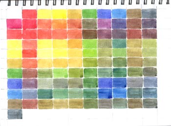
Swatches
To get to know my way around my small paintbox I did swatches
(left) of all the mixes of two colours, trying to get a colour that
was about halfway between the two I had started with. Notice the subtle Paynes
Grey tinted colours in the last vertical column. Paynes Grey isn't
strictly necessary but it's a quick way to dull colours - often necessary when
you're painting in the English landscape! - and you can use it as a tonal under-drawing
for subjects in light and shade, depending on the colour you're going to use
as a wash over it.
Paynes Grey varies greatly from manufacturer to manufacturer. I'd describe
the Winsor & Newton version as having a greenish tint.
Rainbow Order
I realise that I have got my blues and yellows in the wrong order. I’m
aiming for a spectrum/rainbow arrangement, so the greenest blue should
be nearest the yellows, the warmest yellow nearest the reds.
Winsor Yellow is nearer to red than Winsor Lemon
and my Winsor Blue – since I bought the green
shade - is nearer to yellow than the French Ultramarine.
So this is my new arrangement:
| |
|
|
|
|
|
Permanent Rose |
Scarlet Lake |
Yellow Ochre |
Winsor Yellow |
Winsor Lemon |
|
|
|
|
|
Permanent Sap Green |
Winsor Blue |
French Ultramarine |
Raw Umber |
Paynes Grey |
|
|
When I renew the colours, I will probably replace Yellow Ochre
with Raw Sienna, which is transparent.
‹previous
| this month | home
page | e-mail me | next›