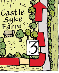
 IT'S
SO GOOD to get back to my walks booklet. This map
has to fit into a quarter of a page so I'm going to have to reduce it by about
50%, so I decided I'd go for a bolder line.
IT'S
SO GOOD to get back to my walks booklet. This map
has to fit into a quarter of a page so I'm going to have to reduce it by about
50%, so I decided I'd go for a bolder line.Richard Bell's Wild West Yorkshire Nature Diary, Thursday, 15th April 2010
IT'S
SO GOOD to get back to my walks booklet. This map
has to fit into a quarter of a page so I'm going to have to reduce it by about
50%, so I decided I'd go for a bolder line.
![]()
![]()
Instead of using my usual extra fine Rotring ArtPen, I've looked out my ArtPen with a 1.1 nib, which I experimented with a few years ago. It wasn't the quality of line that led me to abandon the 1.1 nib; it was the prohibitive cost of toner for printing the walks booklets at home. A 50% thicker line meant that I used 50% more toner when printing on each map. It soon added up when I had a big order. Luckily I don't have to worry about that now that I get my booklets printed commericially. I love being able to use a lot of colour on my pages.
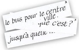
We've been teaching ourself French with the aid of flash cards
which I've been writing with a large calligraphy nib, so I've decided to go
for my relaxed version of calligraphy in the lettering for the map. As always,
I'm keen for the maps to be as clear as possible and I'd like to try and capture
the character of that particular patch of countryside you. I'm hoping that leafing
through the booklet people will be tempted to get out there and walk the route
for themselves.