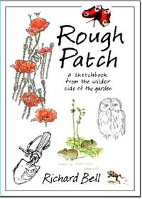
A busy version of the cover

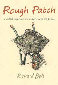
The new improved, simplified cover
|
'As for the cover,' writes Danny
Gregory, my straight-talking friend in New York, 'These
drawings seem disconnected and don't draw me in particularly. All
the white space seems sort of clinical or pamphlet-y as opposed
to evoking the lushness of nature. While the drawings are very nice,
they don't tell me much of a story; I just go, 'yup, poppies, vermin,
digging thing, got it' as opposed to being intrigued by what the
“wilder side of the garden” might mean.'
'What about one over all image, a special painting done for the
cover and that fills the whole thing and has the text integrated
into it? A landscape of your whole garden or one corner of it complete
with creepy crawlies might be nice as a subject. Maybe put Barbara
into it, weeding.'
Barbara, who has been asking people at the library
where she works what they think about the cover, and getting a very
favourable response, flatly refuses to be my cover star!
My friend Godavari, in London, suggests a single
image, perhaps with a touch of humour. Richard Knowles
at our local bookshop says it's fine, but he doesn't like white
covers; they can soon get grubby, as can, perhaps surprisingly,
black covers. So there's a bookseller's practical point of view.
Poppies
 John
Welding also thinks that I should simplify my design and
he e-mails me some images where the poppies (right) or
voles are given prominence. John
Welding also thinks that I should simplify my design and
he e-mails me some images where the poppies (right) or
voles are given prominence.
My problem with selecting one image is that it then seems to take
on extra significance; so the poppies here might make me think of
World War I poets, of sentimental ballads or they may give the impression
that the book is concerned mainly with botany.
I decide to try out the drawing of the wheelbarrow that I made
yesterday on the cover. It doesn't take long to drop it into place.
Yes, I like that, and, when I print it out and try it on my pin
board against the earlier versions, I find that it has more integrity
than the soft all-over-ness of the previous versions.
And, although it is just one image, the wheelbarrow-full of trimmings
does go with my Rough Patch title and it has a touch of
humour to it. Godavari will like that! But I can't help thinking
it now looks like the cover of children's story . . .
Links
Danny Gregory
Rickaro Bookshop
John Welding
|