 |
Last night, according to the local weatherman,
was the hottest in living memory and today it rains most of the
day, making writing my Norfolk Sushi sticky work. But I
keep at it, turning down the opportunity to draw an enormous caterpillar,
probably an elephant hawkmoth, that has turned up on a neighbour's
doorstep.
After reading my diary for Saturday, my artist/journalist pal,
Danny Gregory, suggests: |
I wondered why you don't do you first draft in a handwriting-like
font and save yourself the trouble of writing it all out twice?
You can see how it generally fits on the page and do you re-editing
on the PC. Then, do the handwriting as the final step.
 I
find I am working this way most of the time when it comes to projects
that will be printed. When I am happy with everything, I print it
out (sometimes at 150%) and then throw it on the lightbox. The typeset
words are a rough guide but I feel free to embellish or deviate,
knowing that the finished lettering will fit properly. I also find
I can zone out while doing the lettering and not have to worry about
missing words or misspelling. The only draw back is that it can
get a little boxy as crude computer design can be. I just have to
remember to make it organic as I go. I
find I am working this way most of the time when it comes to projects
that will be printed. When I am happy with everything, I print it
out (sometimes at 150%) and then throw it on the lightbox. The typeset
words are a rough guide but I feel free to embellish or deviate,
knowing that the finished lettering will fit properly. I also find
I can zone out while doing the lettering and not have to worry about
missing words or misspelling. The only draw back is that it can
get a little boxy as crude computer design can be. I just have to
remember to make it organic as I go.
Then I scan the hand-lettered layer, bung it into
photoshop and Robert is your mother's bro.
|
The Comic sans typeface gives
the impression of hand-lettering but it's too regular to sit
comfortably with the pen and ink drawings in my sketchbooks.
It would serve as a quick way to block out the text areas
when designing the page. |
|

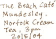
Just the way I was thinking too, while I've been re-writing my Norfolk
text again and again. I shall try setting up the text on the computer
first when I start writing my next title.
But there has been an advantage in spending hours and hours on the lettering;
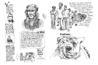
I've developed several rather different styles of handwriting:
Hand-lettering Styles |
 |
 |
|
1. The notes I make on location. |
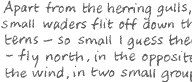
2. My normal hand-lettering. |
 |
 |
|
3. A narrow upright style for the tall narrow spaces that I'm sometimes
left with when I paste an illustration onto a square page. |
4. A more relaxed,
rounded style. I think this is the one I'd like to develop. It's
legible and, being more rounded and open, it seems to have a friendlier
feel.
 |
Related Link
Danny Gregory
Richard Bell, [email protected]
|