Drawing in the City
![]()
Tuesday, 8th March 2005
Wild West Yorkshire nature diary
Drawing in the City
|
|
It's the first time I've been out with a drawing group since I taught at Leeds College of Art 20 years ago. Drawing in PublicA few of my students are diffident about drawing in public so we find a couple of benches by the cathedral and I sit and draw with them to give them a bit of moral support. They soon seem at ease (although after an hour three of them go to draw inside the cathedral 'in the interests of avoiding hypothermia').
|
|
 |
 |
 |
|
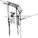
1. It's easy enough to start with a vertical,
like the drain pipe on this corner shop, but how do you judge the
angle at which the roof-line slopes off into perspective? |
2. I often find myself visualising a clock face. In the corner building I'd say that the first roof-line slopes off at about '20 past',while the next goes down steeply at about '25 past' (about 110 and 150 degrees to vertical). |
3. There's a way of double-checking these angles: imagine that the whole of the building is one piece of a child's wooden jigsaw puzzle: you'd now be looking for the corresponding piece of sky that would interlock with it. |
You need to look not only for 'positive' shapes like the building but also 'negative' shapes like the visible portion of the sky behind it.
 |
 |
 |
|
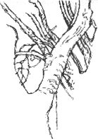
1. When my students started drawing various parts of the precinct, I decided that the most interesting things I could see were the London plane trees growing by the cathedral tower. |
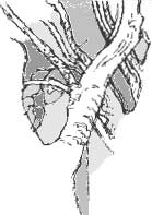
2. All those more or less parallel branches can be confusing so I started with a solid anchor point: the main fork of the tree's boughs. Instead of continuing the two main boughs onwards and upwards I kept jumping to the next interlocking shape. |
3. I've coloured these negative
shapes in Photoshop so that you can see them more clearly.
If I then erase the original line drawing you can see that it would
be possible to 'draw' the tree just by mapping all those negative
spaces. |
 Usually
after a day's sketching I just pack up and go home so it's great to meet
up again with the group to discuss what we've each been up to and what
we might try and tackle next time we meet up in town. So not
the dreaded 'crit' of my art student days, just a relaxing, inspiring
way to round off the work of the day.
I thought that I would learn as much from working with my students as they would from working with me and that has certainly been the case. A couple of them comment on how quickly the day has passed; 3½ hours drawing sounds like a long session but when you get absorbed in what you're doing the time flies by.
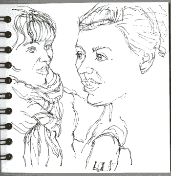
Eleanor and Sally (left) only met today but they're chatting away like old friends.
Eleanor is a keen photographer so today has been a fresh challenge for her.
Richard Bell, [email protected]