| 
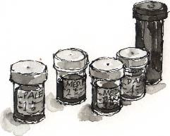
Using the small plastic screw-top sample jars that I bought
at Boots pharmacy the other week, I've tried mixing four washes of Chinese
ink that, along with the black of the ink itself, will give me
an evenly spaced range of tones when I'm on location.
 Working
in wash seems to be a messy business compared to watercolours so, after
splashing about for a bit with my first sample swatches, I change into
an old sweat shirt. Working
in wash seems to be a messy business compared to watercolours so, after
splashing about for a bit with my first sample swatches, I change into
an old sweat shirt.
Watching Ink Dry
 It's
difficult to judge the tones as you mix them because when you try them
on the page they appear darker than they will once they've dried. This
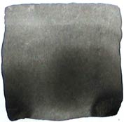
seems to be especially true for the darker tones, such as my number 3,
'medium dark' as I've called it, which I photographed (left)
as it was drying; you can see that the wetter, lower half of the wash
was a tone or two darker than the drier top half. It's
difficult to judge the tones as you mix them because when you try them
on the page they appear darker than they will once they've dried. This
seems to be especially true for the darker tones, such as my number 3,
'medium dark' as I've called it, which I photographed (left)
as it was drying; you can see that the wetter, lower half of the wash
was a tone or two darker than the drier top half.
It's important to label them as the washes look identical
in the jars. The fifth, tall screw-top jar contains the Chung
Hwa Chinese Ink (it is supplied in an attractive but, for the
purposes of fieldwork impractical, ceramic bottle).
' In Japanese Brush Painting class we actually grind the
ink with the stick onto the inkstone,' writes my friend Rachel
from San Diego, 'But certainly there are lots of records of painters centuries
ago who used ink and stone on location. I just don't know how they did
it. For us, instead of watering the ink down into bottles, we place some
of the darkest ink onto a white plate, then use some water to dilute this
down into a greytone. In fact, I often end up with several different greytones
on the same plate, sort of a palette.'
 Any
colour you like, so long as it's grey Any
colour you like, so long as it's grey
Apart from the inherent messiness and the bother of carrying
four bottles of wash along with my Chinese ink, I think this method will
work well on location; it's quick, like painting-by-numbers. I like to
start with the lightest tone and work to the darker ones. You don't have
to wait until the first wash is dry, as you do in traditional wash drawings
where you lay one wash over another to produce a luminous graduation of
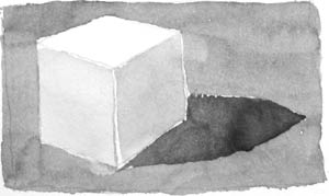
tone. In these drawings, I left the darker areas blank when I started
by painting in the lighter tones.
Like Rachel says, it is like having a limited palette available,
except they're tones instead of colours. 
Richard Bell, [email protected]
|